|
History of BMW motorcycle logo, emblems or roundels |
|
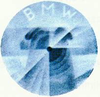
The source of the famous BMW emblem
This is an artist's drawing of the propeller of an airplane. This inspired the current BMW emblem. WarningBMW has changed the emblems many times over the years. The main thing to know about these screw on cloisonné emblems is not to over tighten them. That will distort the base metal and will crack the cloisonné enamel. A rubber gasket is mounted between the emblem and metal to help cushion it. A properly tightened screw can almost be turned with a strong thumbnail. The screw slots aren't "aligned" because they were left where they came to the proper tension. Many have been cracked because the installer wanted to be sure they stayed on or wanted the slots to be lined up and went a bit too far. Some of the tank surfaces are not flat to start with. They must have a curved emblem to fit. The enamel emblem will not conform (flex) to fit a curved surface. You will ruin them. A history of cloisonné enamel can be found at http://www.everlifememorials.com/urns/cloisonne-urns.htm I hope that you will enjoy the pictures of the BMW logo, emblem or roundel. BMW used several suppliers in the early days and you may see them from any of the producers. The size also varies slightly from 6 cm.
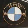
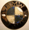
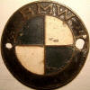
This shows the emblem that was typical of the tubular frame early models. This beautiful emblem is on a R39 and was supplied by Thomas Welzel, thanks. This lovely 7 cm emblem is on a R42, thanks Chuck From the 30's. The metal is copper colored, probably brass. See the slight font difference from the one above? This one is from a pre-war R12 and is just over 6.1 cm diameter. Large file, slow to load up. Thanks Paul Gubbels. This is the back side showing the supplier. Large file, slow to load up. Thanks Paul Gubbels. This is the typical emblem from the late 30's. It is 6 cm in diameter. Reported to be from 1940-45. Thanks Paul Gubbels. The emblem with copper letters and is correct for all bikes from the middle 50's till the early 60's. I don't remember when the copper ended and the silver color started. Any evidence/proof would be welcomed. Thanks Paul Gubbels. This is the emblem that is correct for all bikes from the early 60's on to mid 66 or so. It is distinguished by the narrow letters with the serifs. It is 6 cm. in diameter. The metal letters were changed from copper color to a silver color and is probably nickel.
In mid or late 1966 (I think) the font was changed to the block style letters without the serifs. All /2 were 6 cm diameter. This is one of the /5 emblems with the screws and gasket. It is 7 cm in diameter.
This is one of the "stick on" plastic emblems used on the /6. It is 7 cm. in diameter. In 1974, on all but the R90S, the emblems were changed to glue on plastic. These emblems would "yellow" in the sunlight, unless they fell off first. This is one of the "stick on" enamel emblems for a R90S. It is also 7 cm. in diameter. A few of the Silver smoke bikes in 74 had the plastic emblems, but most were enamel. All of the Daytona Orange models that we saw had the enamel emblems. This is a large enamel sign from the 50's that would advertise a BMW dealership. It is 23" across and only the second one that I have ever seen, thanks Chuck. This is the more common large enamel sign from a 1979 BMW dealership. It is 23" across. These letters are not yellow, as above. Thanks Dennis Allstead This is the high mileage award emblem for documenting 100,000 miles. It is awarded by the factory via a BMW dealer. It is new and still in the unopened cellophane wrapper. This one has silver letters. Stephen Ascherl hooked me up with the BMW racing roundels I was looking for. These are water-slip decals and are 64mm across. They were used on race bikes because the screw-in roundels could be dangerous on the track....like when they come unscrewed. Also, the decals weigh almost nothing. You would soak them in warm water for a couple of seconds and then apply them to the tank. Peel off the backing paper and blow dry. Just like with model airplanes. They then get covered with a clear coat. Thanks to ???
Variations of and additions to the BMW logoOver the years the BMW logo has been altered, or modified for some reason. I hope to collect a few examples and show them. The main reason to show variations is for the restorer to know if the ones on a bike are BMW or some aftermarket item. This was sold by San Jose BMW for the Motorsport in 1978. Photo donated by Chris Bynum, thanks. A kneepad from Eisenacher Fahrzeugfabrik, or better known as EMW. During the war (and afterwards too) they made the R35. CautionSome of the current reproduction emblems for the /2 are not very good. The distance between mounting hole centers isn't correct. When one installs them, the screws don't bottom out. They are a bevel headed screw and they must bottom out or they are obviously not right. It is very difficult to go in and fix the hole. Let me know if an improvement is available. RequestI would like to add pictures of older BMW emblems too. The ones from
before the war are very interesting. Please take a similar photo and send
it to the address below with your name, year, diameter and model. I will
put your name under it for credit/blame. I don't want to go to this work
if it is already done by someone else. Let me know please. Thanks.
|
|
This page was last edited:
10/12/2006 - copyright
Duane Ausherman |


